mobile artist page
I used Claude to build the wireframes in this project. The decisions were mine, the execution was AI. Building via AI forces product requirements clear and specific enough to act on, in a way that designing alone doesn't always require.
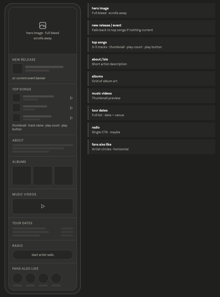
Spotify's artist page treats everything as equally important, which means nothing actually is. Top tracks, albums, tour dates, similar artists: all stacked, all the same weight. It doesn't know if you've been listening to this artist for ten years or ten seconds. This is a rethink of what that page could do for both of those people.
The first session was all structure. Instead of starting from Spotify's existing layout and moving things around, I started with a blank page and a question: what does someone actually need here? The answer changes depending on who's asking. A newcomer needs to understand who the artist is. A fan needs to find what they came for. The page has to work for both without feeling split.
Tour dates kept wanting to live lower on the page as their own section. But that assumed most visitors already know the artist and would just Google tour info separately. Once I thought about it, if an artist is touring, that is the event. There's no version where they have tour dates but nothing worth surfacing at the top. So they moved up, collapsed under the event banner, only appearing when there's something to appear under.
Radio and tour dates both sat unresolved longer than they should have. I kept making assumptions based on how I personally use Spotify rather than stepping back and thinking about the range of people who use it. Both got resolved eventually through logic rather than taste, but I caught myself indexing on my own behavior a few times and had to course correct.
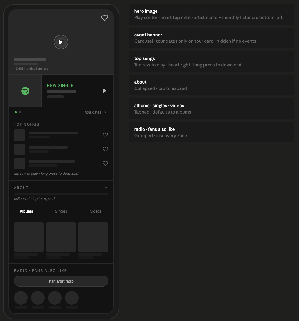
Session two was about the details. The event banner was blending into the rest of the page and it needed to stand out more. The hero image had no interactions and felt passive. The top songs section had too many elements crammed into each row. A lot of this session was about simplifying things I'd overcomplicated in session one.
An artist can have a new release and a tour happening at the same time. The banner needed to handle both without becoming two separate sections. A carousel felt right: one banner, swipeable, dot indicator at the bottom. Dots only appear when there are two cards. Two dots means there's more. No label needed, no instruction. It's a pattern people already know.
The hero overlay had three things to fit: artist name, a like button, and a play button. Putting like and play near each other was a problem because accidentally liking or unliking an artist is a persistent action that's easy to miss. Heart went to the top right corner. Play went center. Enough distance between them that you're not reaching for one and hitting the other.
The track row started with a play button, like, and download all visible at once. Too much for a small space. Making the whole row tappable to play removed the button and cleaned things up. But download on long press is still an open question. Long press is an invisible pattern and a lot of users won't find it. A three-dot menu on the row might be more honest even if it's less clean.
Working this way is faster, but only if you know what you want. When I was vague, the output was vague. When I was specific about what I wanted and why, it came back right. That part isn't really about working with AI, but about design and product itself.
The thing I didn't expect: having to say decisions out loud made me think through them more carefully than I usually do when I'm moving things around in Figma. You can shift something visually and tell yourself it feels right without ever having to justify it. You can't do that in a conversation. That turned out to be useful.
The Amazon project went the other way: I designed it myself and used AI to help document the process after the fact. I don't think one approach is better. They're different ways of working and I wanted to be comfortable with both.